Kaum eine Arbeit des in Brasilien lebenden niederländischen Künstlers findet nicht den Weg ins Künstlerbuch. Über fünfzig Publikationen hat Erik van der Weijde in den vergangenen 12 Jahren erstellt – teils aus eigenen Fotos, teils aus gefundenem Bildmaterial.
Andreas Till sprach mit ihm über die privaten Aspekte künstlerischer Arbeit, die Bedeutung des Einzelbildes im Gesamtwerk und seine Herangehensweise beim Editing von Künstlerbüchern.
Erik van der Weijde: Yesterday evening, I had to think about how many of your questions feel really personal to me. Almost like you were asking questions about my childhood or about things I have never really told anyone. My working process is a very personal one and as life and work are so closely related, questions about my work are very personal. So, opening up about it feels very challenging. If you were a researcher and would look for the answers to those questions, you would probably find an answer to most of them, I believe. However, when asking questions, the issue becomes much more personal, even if most questions are technical in nature. Maybe this means that technique in my case is not skill-based, but experience-based. In these premises, experiences are personal, right? My process gets more and more personal every year. It is about the choices you make, the things you do, and especially the things you don’t do. The things you don’t do are usually invisible to other people. If I decide not to do something, the viewer will never notice that. For me, that can be a very important decision, for example not to do a show or a publication with a publisher I don’t feel really comfortable with. Those invisible decisions are even more personal than the visible ones.
Andreas Till: Do you show one photograph in more than one place/book? If so, why?
Yes, I do that all the time. I use and re-use my photographs. For example, my projects Der Baum and Superquadra, as well as This Is Not My Son and This Is Not My Wife contain images that are part of both respective bodies of work. I apply this practice all the time, because in a way all my books are related to each other. By reusing those same photographs, I point out that everything is related. It’s like a red thread, which runs through all my books, all my projects. Also, sometimes an image is part of one project, the Trees series for example, but the building in the background of that same image is part of the Superquadra series, too.
That’s interesting. I know photographers who say they won’t use a photograph in multiple places and I can partly relate to that as an image’s context changes completely with the place it appears in. However, if we are talking about sequencing and relating pictures to each other, I must think about equivalences between narrative in literature and narrative in the photo book, the photo becoming something like a word, a sign. You have this one picture situated in one body of work and to this one it belongs. If you use the picture in another work as well it becomes a kind of different vocable. It is like a brick in a building which you can re-use as much as you want, although its function may change according to its positioning in a certain context.
Two things you mention here are both very important to me. Firstly, you say, if you use a picture in another series the context changes. That is exactly what I do all the time. I take things out of their context and put them in my own contexts, as in a book or in a series. Even if, let’s say, I take a photograph of a tree, I separate it from its original context as, for example, the place where it actually stands and I integrate it in the context of a series, which relates much more to history. However, there is a bigger context, too, which is me building my work. Within this bigger context, the same image can come back in a different series.
Secondly, I feel that all of my projects, all of my publications, are part of something you might want to compare to a building, like my house that I’m constructing. I think, Fassbinder made this comparison to his work, too. One work may be the garden and one work may be the kitchen, another one the bedroom. However, works are also similar to the actual bricks of a house. In different rooms you can see the same brick, but maybe as a viewer, if you enter the room, you don’t see the bricks anymore. You only see the crazy curtains hanging in the window, but the bricks are still there.
Do you reflect on the same picture differently when it’s located in a different body of work?
No, not really.
So for you, the meaning of the picture doesn’t really change?
No, because the final destination as well as the starting point is to give those images and things, found and collected, a place within my mind.
That’s the place they occupy in the beginning, and in the end that’s still the core of what I do. It doesn’t really change. If I show the same images in different projects, it’s different for you as a viewer to see them in another project as you relate to each project differently. You create your own context for the work and that is different from my point of view.
Have you ever considered starting off a book with a concept instead of beginning with the pictures? How would that look like?
I think I haven’t done it yet, but that’s something I am actually working on at the moment. As a matter of fact, there are a few series that are relevant. However, their starting point is not in photography, but in printing techniques or prints and their structural elements, like a raster or color separation. Those are much more abstract projects, which I hope I can turn into some publications. I am constructing images, not photographs, out of my ideas or out of things I am fascinated by, especially in printing.
You see, I work in a completely opposite way. I usually start with an idea and then I think about it for a long time until my head is totally messed up with thoughts. Most often, I start with a feeling of what I want to express rather than with a concrete visual idea of what the project might look like. Then I start narrowing it down in my head until I get to maybe three or four general elements, which make for the formal theoretical structure of the work and as soon as that is done, I start working on the pictures. That’s the hardest part, because I don’t especially like taking photos.
For me, the concept usually comes in maybe just before half way into the project. It always starts off with collecting and researching and only afterwards evolves the actual concept, both the micro and the macro designing of the project. Then there’s always a period of thinking and rethinking a lot. However, it never starts with that. My approach is always picture-based.
For a project I did two years ago, I had a particular concept, but now I feel that the pictures it contains are utterly interchangeable. So that is where, for me, problems arise when it comes to photography. As in my view they aren’t as important as the concept. They loose their significance in a way so that I could probably use any picture in that project as long as it reflects a certain mood or atmosphere or whatever, but it could be any picture and it is not even necessary that I take it.
I think the dangerous part is where the photographs almost become an illustration of themselves. Where they become an illustration of the concept. A thin line, I think.
Why is the book your medium of choice?
I think it’s totally inherent in the series I make, in the seriality of my work. I also think photography is made for reproduction. In my opinion, the book is the perfect form for the reproducibility of the photograph and I think it’s great for keeping series together.
Do you categorize and structure your picture pool in advance?
Yes, usually. It depends on the project, but it can be a categorization by place, or by pictorial characteristics. My hard disk is categorized by place, country, city, etc.
When putting a spread together: Which criteria are important to you and what are you especially looking for?
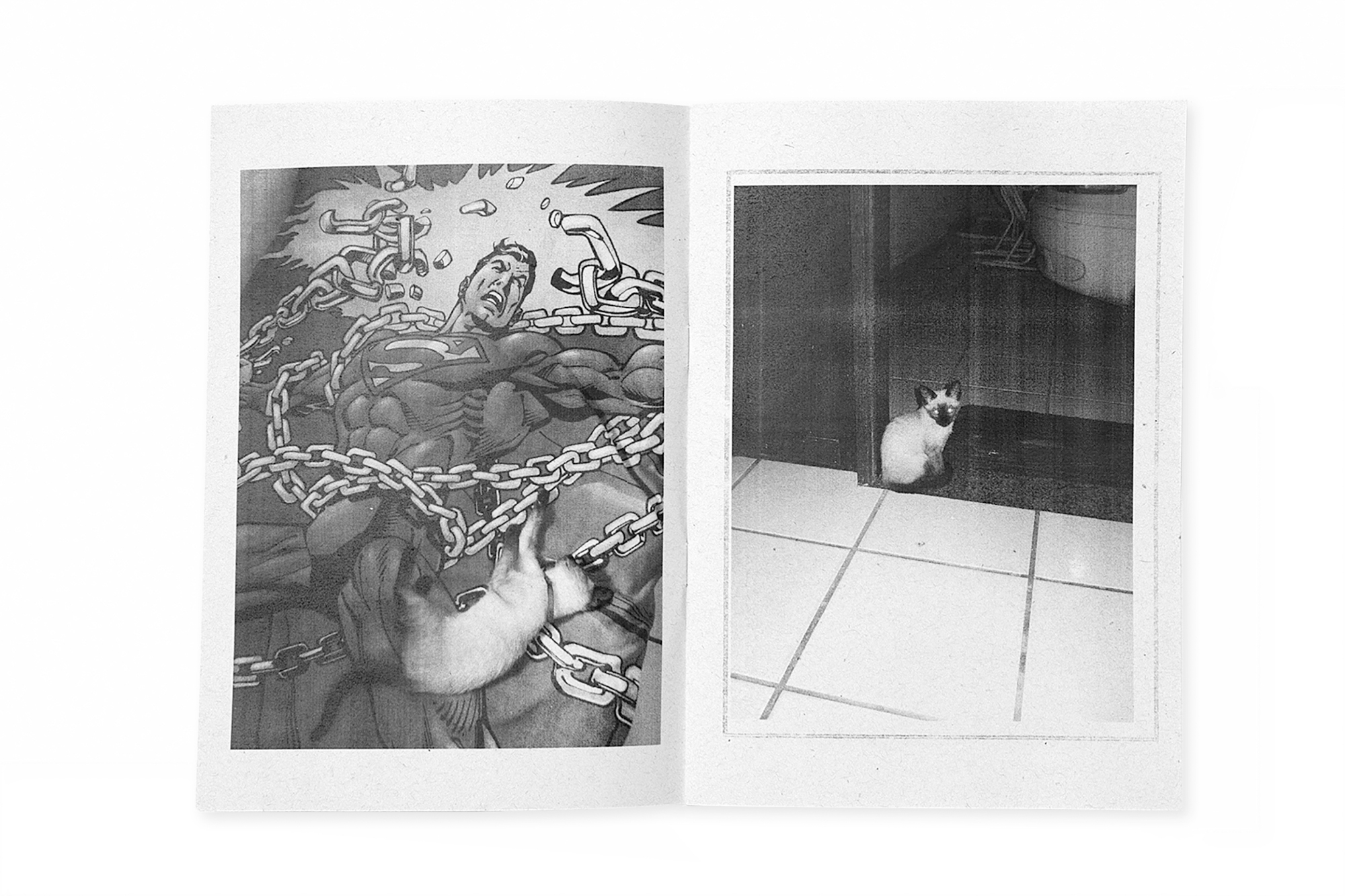
I think it’s 95% based on the actual images. In the beginning, I select the pictures I want to show. They should have certain pictorial characteristics in a way that anyone could have taken them. At the same time they should be like icons for what they represent. After I have selected most of the pictures I start sequencing them and designing the spreads. In most cases, two pictures communicate with each other within an open spread. After I have designed many of the spreads, I start designing the sequence or the flow of images. Turning the pages always creates a visual alignment. Here, an element of a previous page should be picked up in the next. It could be a line from one picture that is continued in the opposing one, or there might be another visual triangle that connects two images.
Something that puts the two pages together and creates one image. That’s I think 95% of the deal when designing the spreads. Of course, I have to break the pattern sometimes, because otherwise the sequence becomes too boring or too much of a trick. So my approach is always present, but it’s not always visible. Those patterns are always there, but I try to hide them in an intelligent way.
How much space do you leave for aleatoric issues in the genesis of your book?
When I start sequencing, I’m quite open to this approach. I like chance to come in, but then I shape it up again. My design is entirely based on the feeling I want my books to have. I play a lot in the beginning to see what happens. Sometimes I think I lose a lot of time working in this way. I reckon, if I were a traditional designer, I could take clearer decisions from the start. I need some time to play and see what happens.
Would you say your editing is more rationally or emotionally conducted?
It’s 80% emotionally and 20% rational, but this is a 90% rational answer…
How flexible are you within your scope?
Well, I can give you an example of my latest book Niemeyer. I had finished designing the spreads from page 1 to 104, but one day before sending it to the printer I sorted out the second page, which caused all the other pages to shift one place. I think that’s quite flexible …
If I recall it correctly, you recently posted your favorite Niemeyer spread on Facebook. I found the spread quite odd to be honest. What were your thoughts behind putting those two pictures next to each other?
I think it’s one of the last spreads I designed. Those two pictures are like leftovers as they didn’t fit with any other picture. Even now, both pictures are almost too strong to place them against each other. That’s what I liked in that combination. It represents the complete opposite of my whole editing pattern. Again, the decisions you make as an artist are important. However, maybe even more important in the end, are the decisions not to do things. I think this is one of those examples. Maybe this is something I shouldn’t have done, but I did it anyhow and, in a way, it works out. You discover new things by doing that. Yeah, but it’s kind of an off spread. It’s a strange spread.
How, in your opinion, does the organization of the macro structure of an artist book contribute to a narrative? For example, if you think This Is Not My Wife in which you inserted pictures of your sleeping wife into the continuous string of other pictures …
I think that’s almost a hundred percent of the narrative. That’s how reading a book works. It’s not the single image or the spreads, but it’s the sequencing of the pages, for example, the position where you break something or repeat something until it gets annoying. This is also the hardest part to do. In a way, 90% of designing the spreads is easy and fun. Sequencing the spreads, which is maybe what you would call the macro structure, is the hardest but also the most important part. I think the fact of putting pictures of my sleeping wife in there was a rational decision for me, but the most difficult part was to decide, in which segments I wanted to introduce those pictures. That’s what really constitutes the narrative.
What happens to photographs that don’t survive your selection process?
They remain on my hard disk. In 99% of the cases, I never use them. As I mentioned before, I consider my images as icons for what they represent. That can again be a place, but also a mood for example.
How much time do you take for editing?
A long time! It can take up to a couple of years. I might add 10–15% in the process, but in general I delete 50–70% at this stage. The process is all about fine-tuning and deleting. I sort out as many photographs as possible.
Erik, thank you very much for your time and your effort.
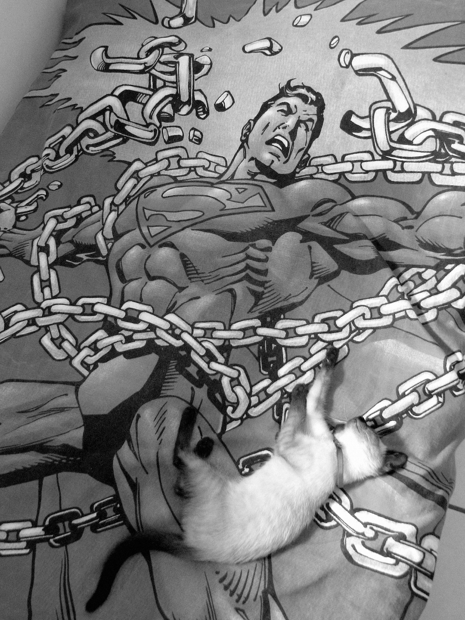
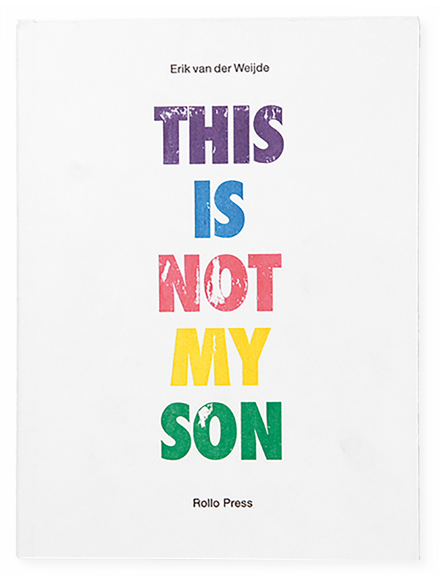
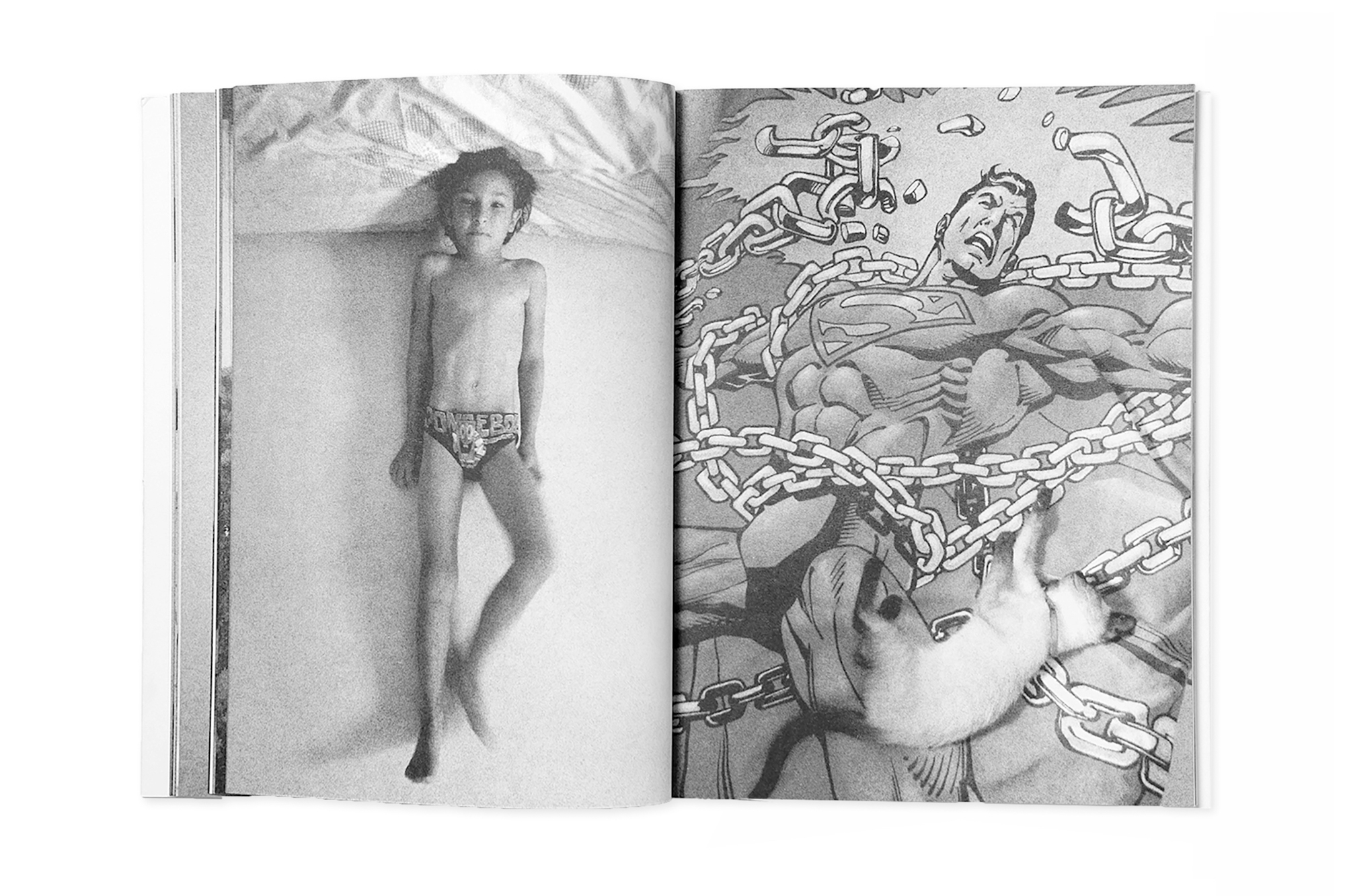
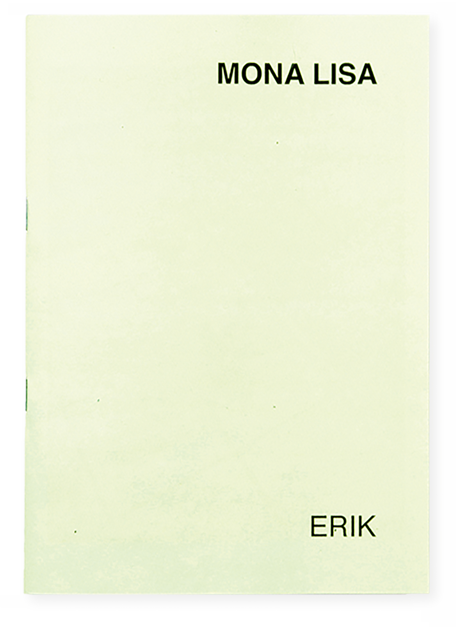
Abbildungen S.20
This Is Not My Son, 18,5 × 25 cm, 108 Seiten, Edition 2009
Mona Lisa, Set aus 3 Zines, 21 × 14,8 cm, je 28 Seiten in Mappe mit bedrucktem Umschlag, Edition 2012
The interview was conducted via Skype on 2 November, 2012, and is part of Andreas Till’s extensive series of interviews inquiring about editing methods in photobooks.
